
How to Select coordinating fabrics
We get it... selecting fabrics online can be hard. You computer or device may not be displaying the colors correctly and nobody wants to be surprised with color tone after delivery. Most quilts and rag style projects will use multiple fabrics and colors so we have created this page to give you some tips on fabric selection. Please remember that if you need to see fabrics before purchasing we have a sample product option available here: Buy Samples If the exact shade of color is important, we always recommend samples before purchasing.
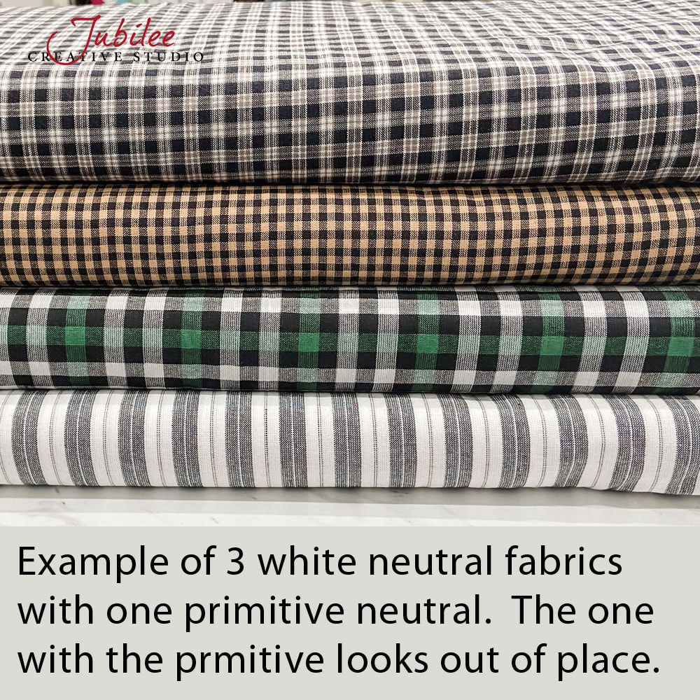
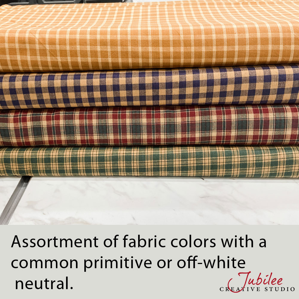
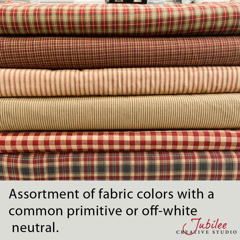
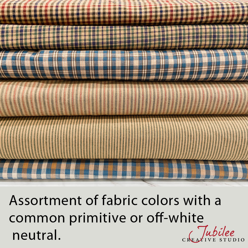
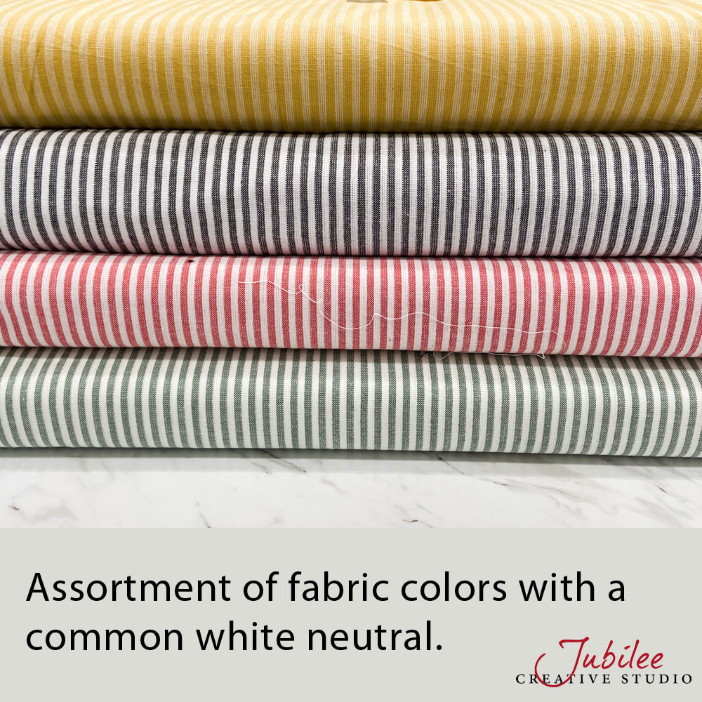
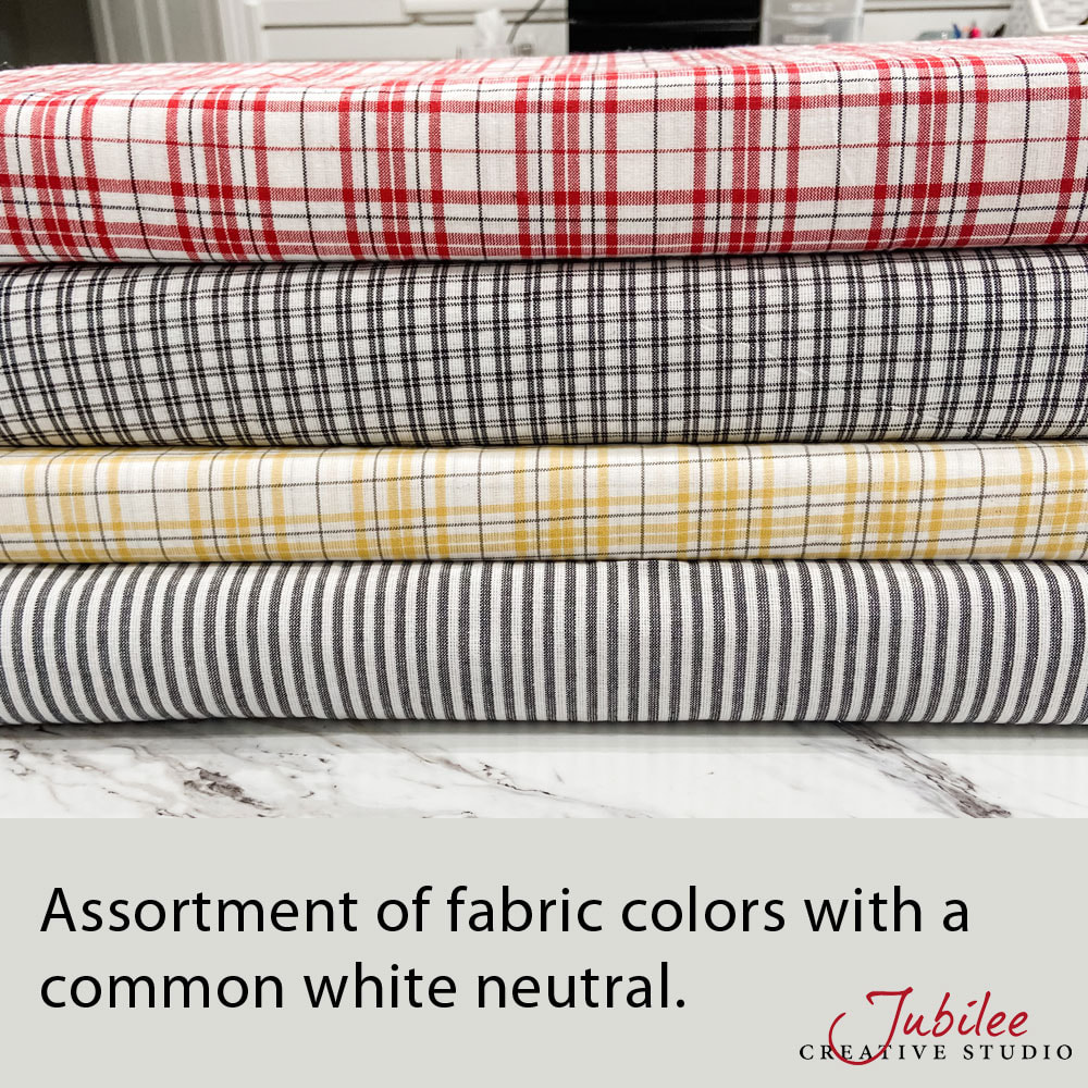
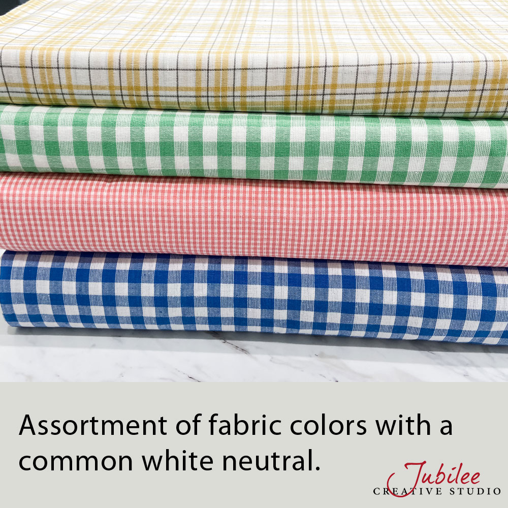
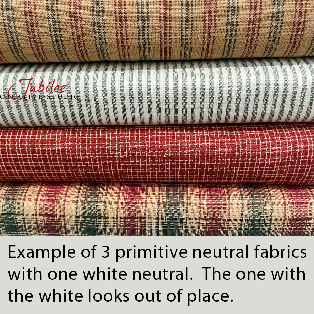
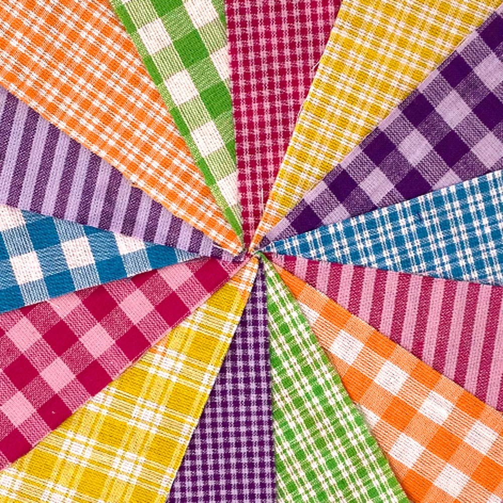
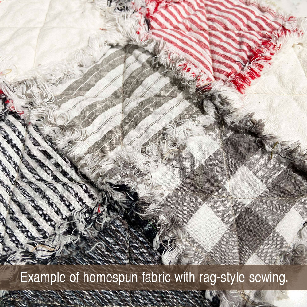
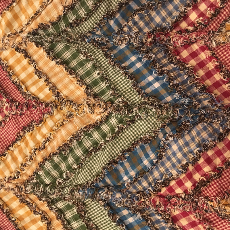
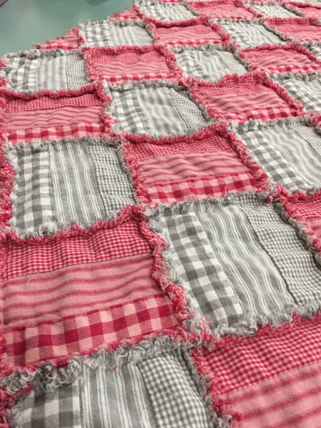
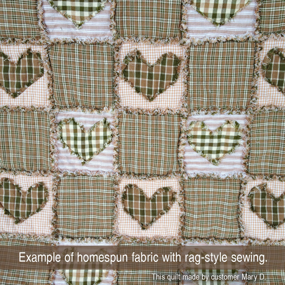
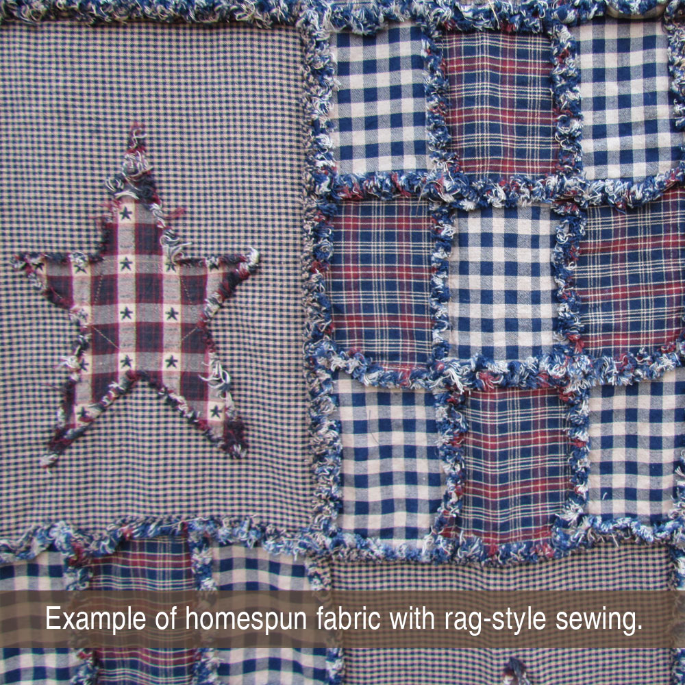
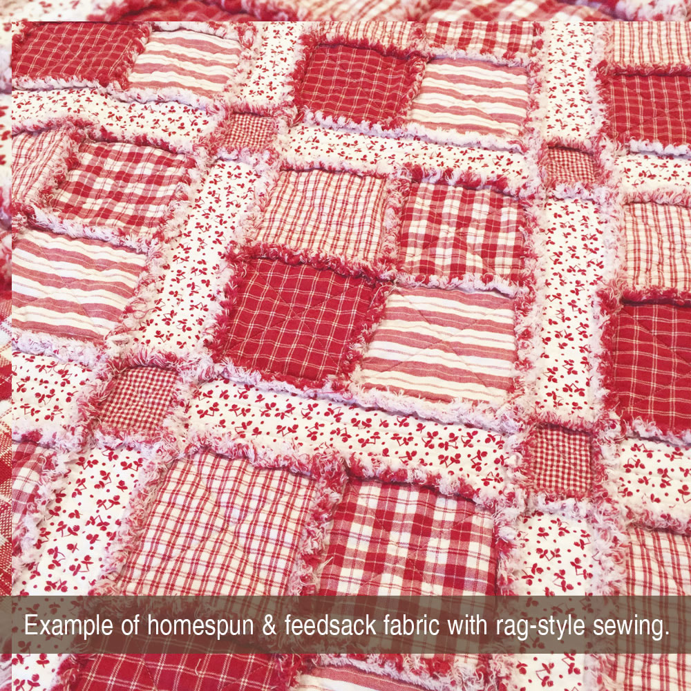
Based on our years of experience with homespun, the #1 most important factor is the neutral color in your plaids. Most of our fabrics will have either a primitive neutral, a white neutral or a cream neutral. Often you can mix and match all the other colors according to your preference and as long as the neutrals match up, you will have a nice looking assortment. These pictures below illustrate how important the neutral color is. Click on the pictures to view them full size and read the comments.
Based on our years of experience with homespun, the #1 most important factor is the neutral color in your plaids. Most of our fabrics will have either a primitive neutral, a white neutral or a cream neutral. Often you can mix and match all the other colors according to your preference and as long as the neutrals match up, you will have a nice looking assortment. These pictures below illustrate how important the neutral color is. Click on the pictures to view them full size and read the comments.
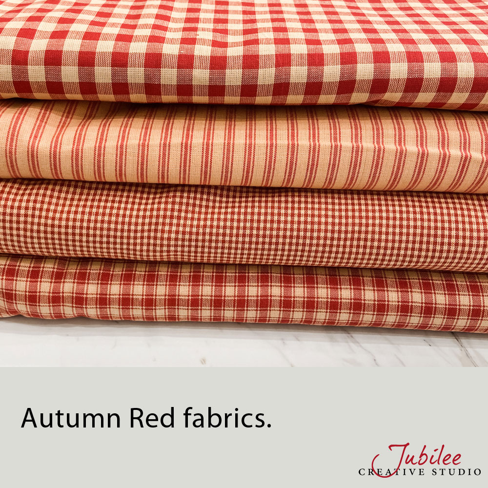
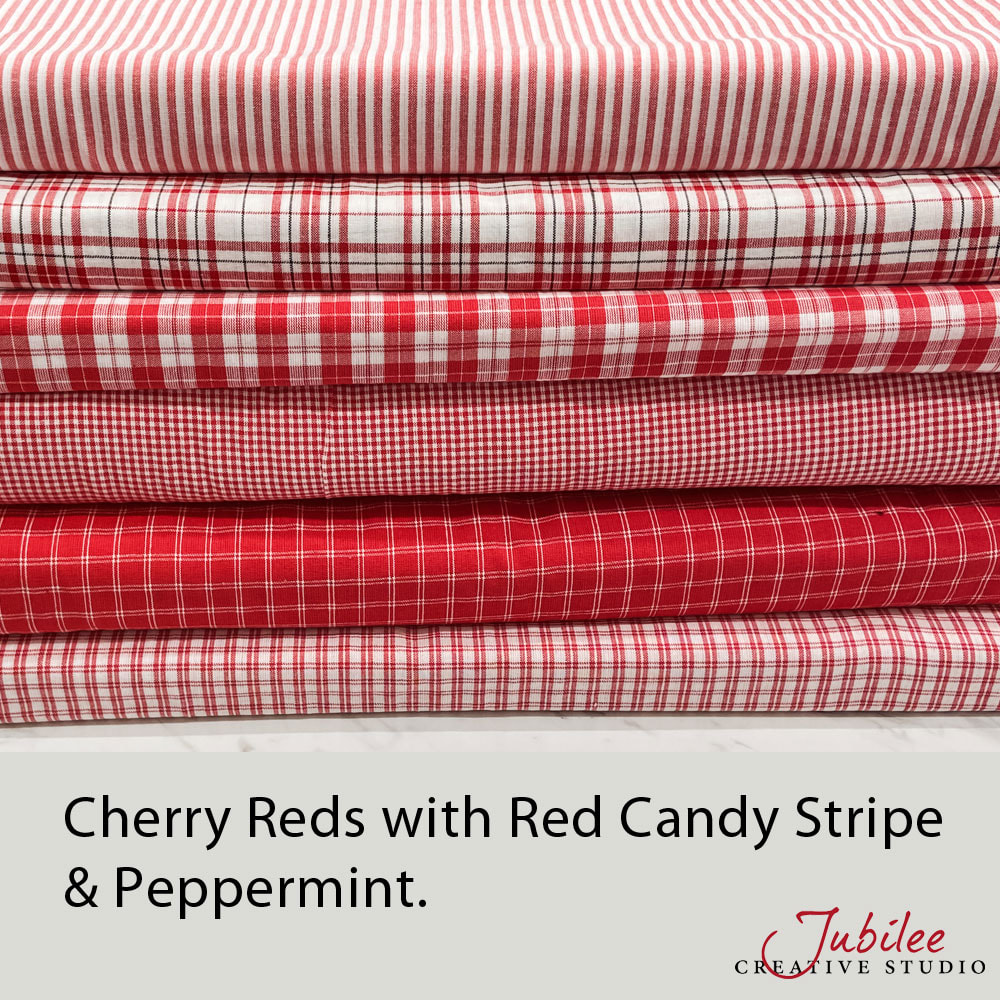
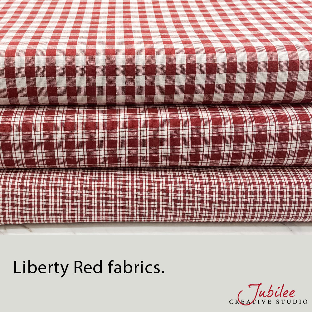
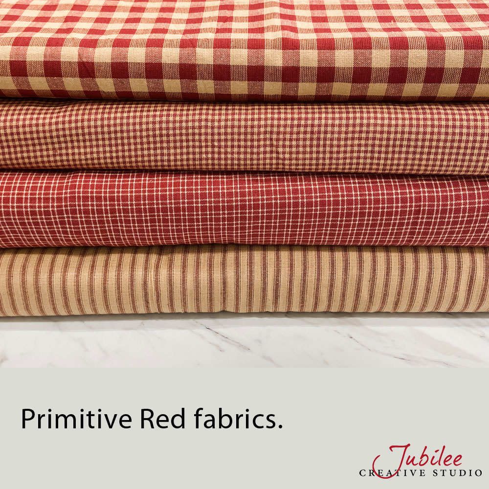
A popular color that is easily confused is red. At the time of this writing, Jubilee Fabric has Primitive Red, Autumn Red, Cherry Red and Liberty Red. Generally speaking, these reds do not mix/match very well. Each of them have their own unique style and a touch of red can look good in so many different projects. But only if you have the "right" red! Many of our other fabric lines have red in them and if you are questioning which red to combine with a fabric that already has red, just shoot us an email and we will make a recommendation.

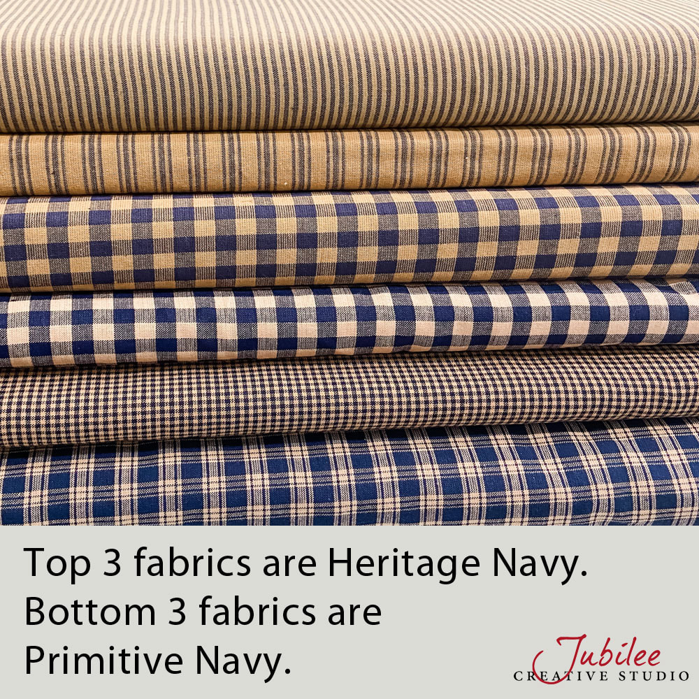
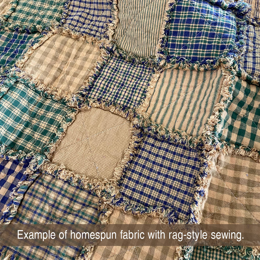
In most cases, when two fabrics share a similar name, you can feel comfortable that they will match up. If the first part of the name is not the same, they likely will not be the same color. But that doesn't necessarily mean that you shouldn't use them together in the same project, just don't expect the colors to be the same. Some good illustrations of that are shown in the images below. Heritage Navy Blue is not the same colors as Primitive Navy Blue. Timber Green is similar but not the same as Primitive Green. Driftwood Brown and Cabot Brown are not the same colors but they still look great together.


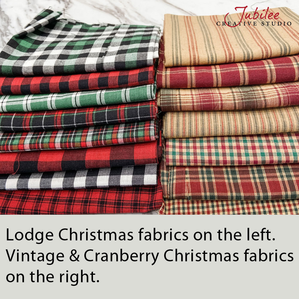
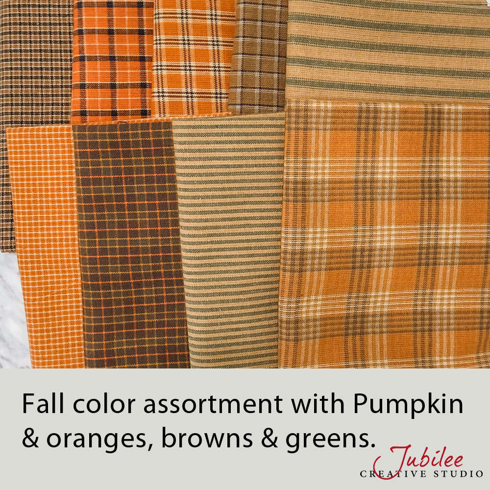
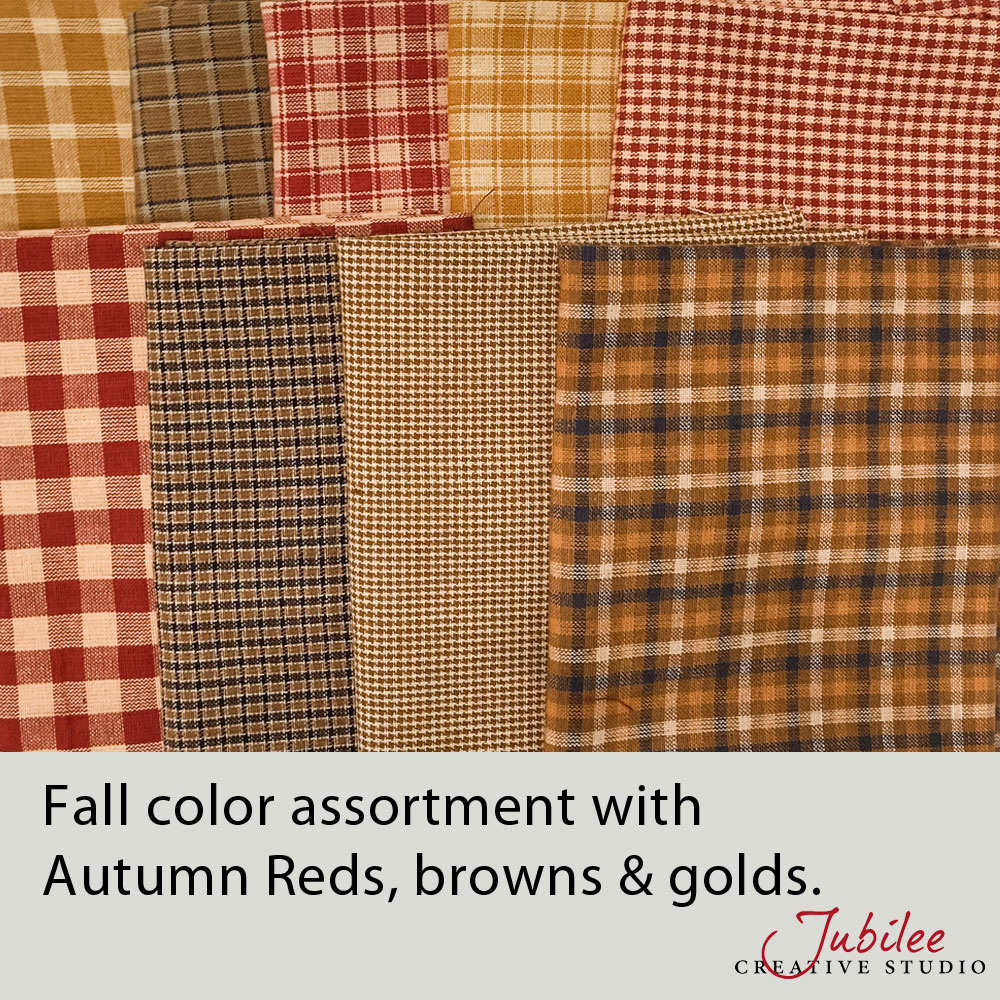
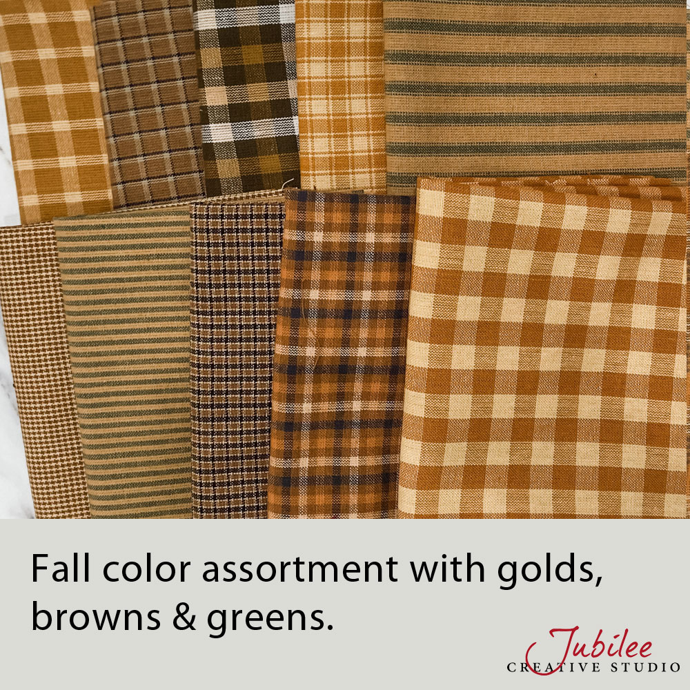
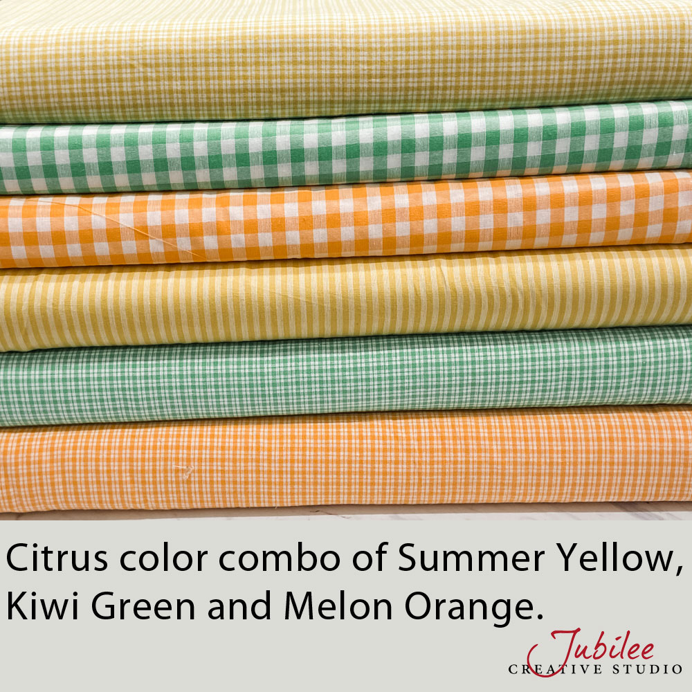
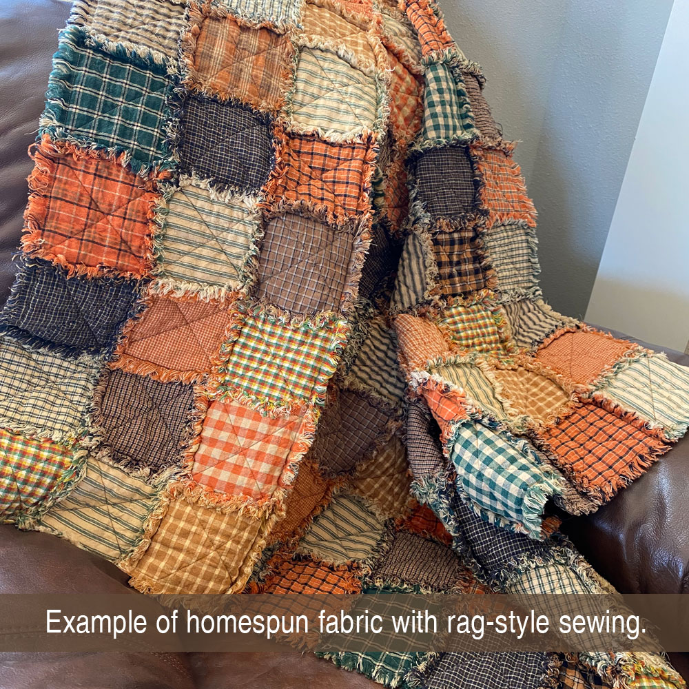
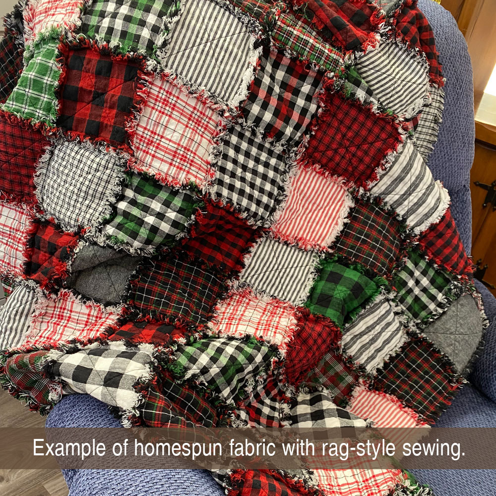
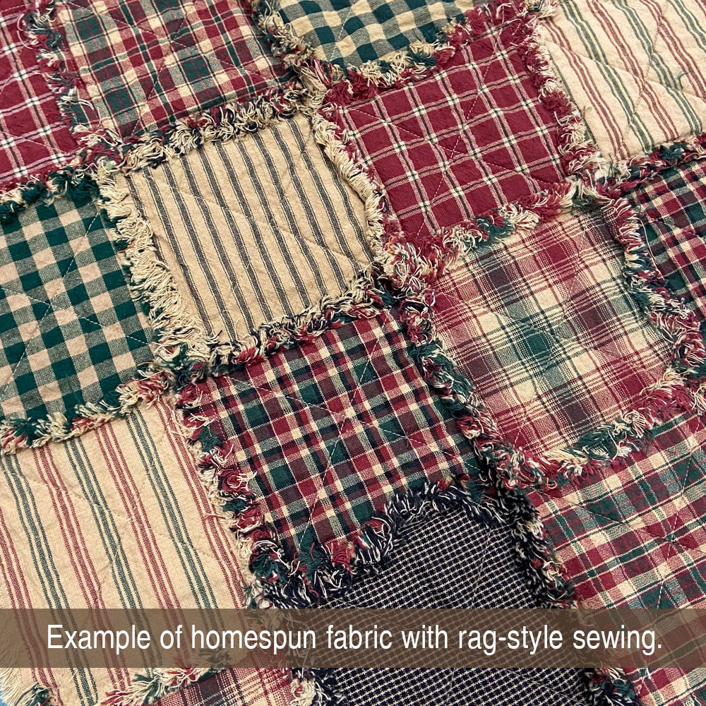
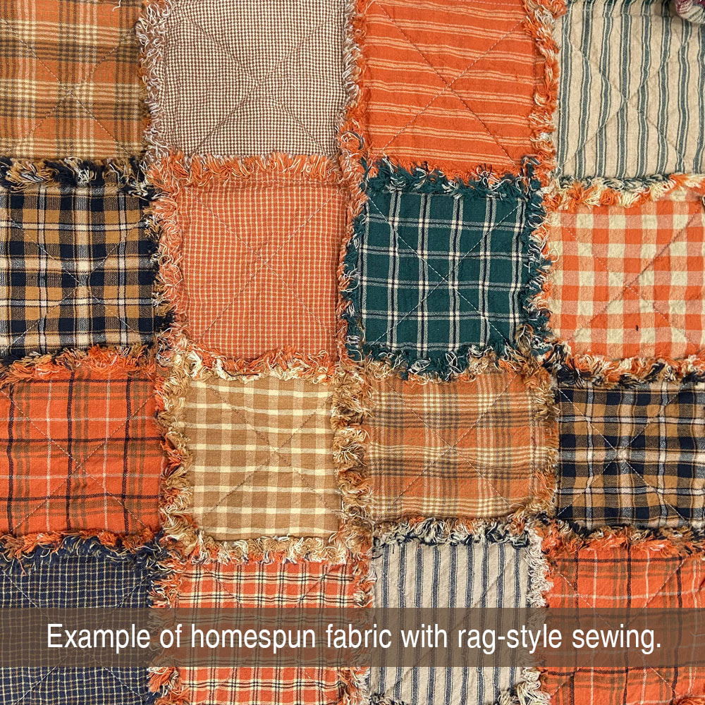
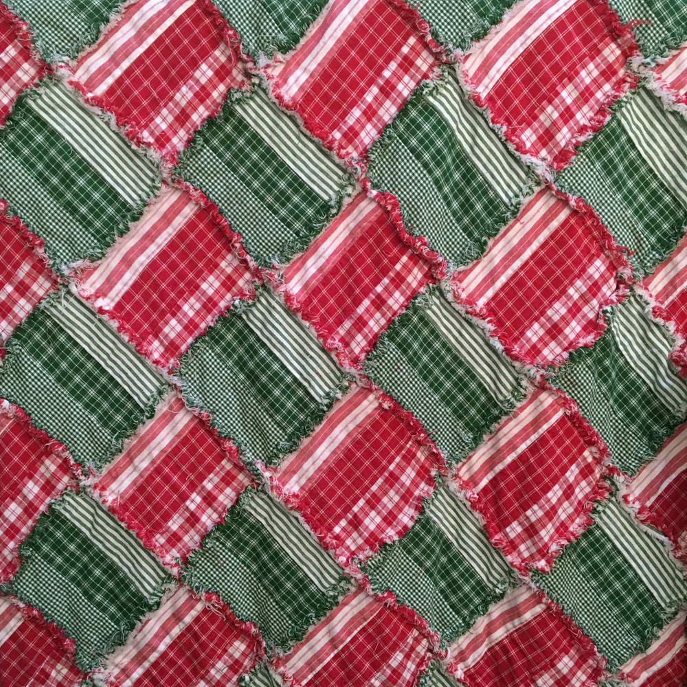
Are you thinking of a Christmas project or something for the fall holidays? Some great holiday fabric combos are shown in the pictures below. Autumn combos can lean toward the pumpkin orange, gold or even just browns. All will coordinate very well with autumn decor.
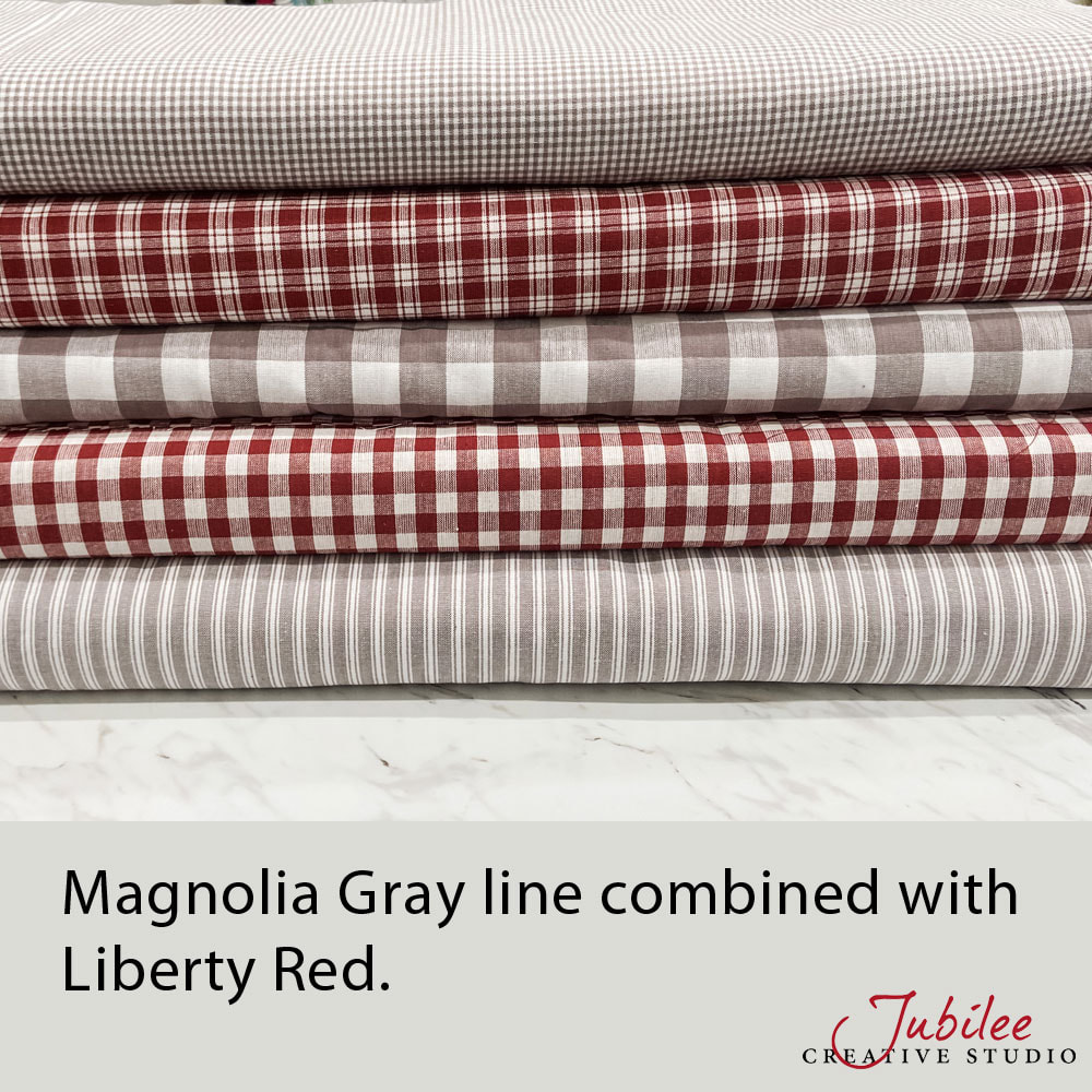
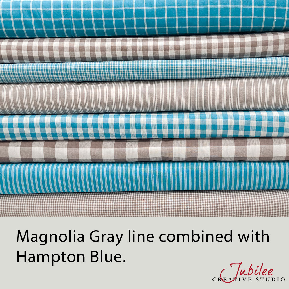
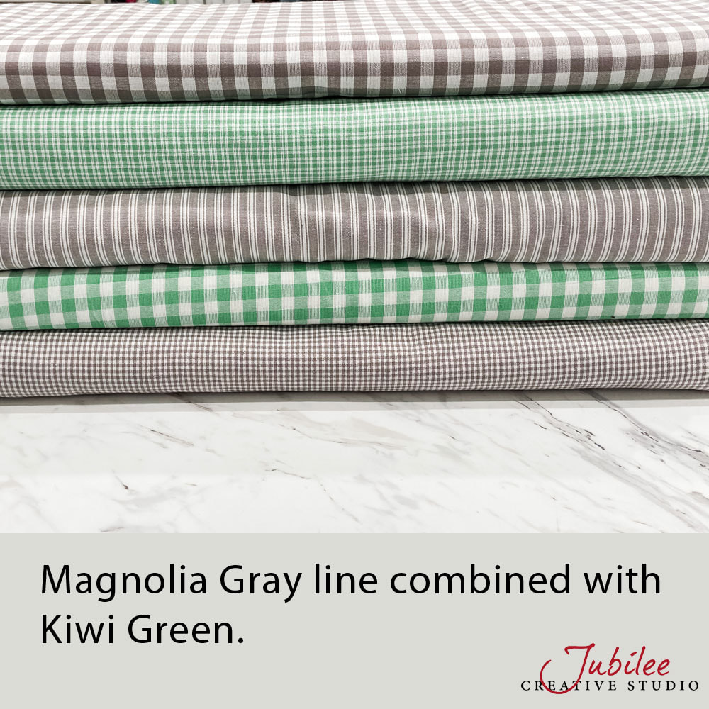
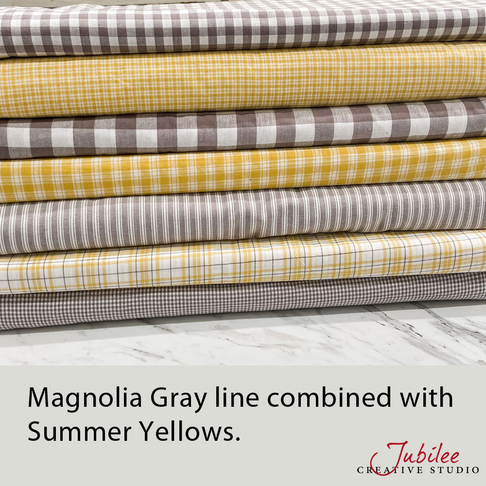
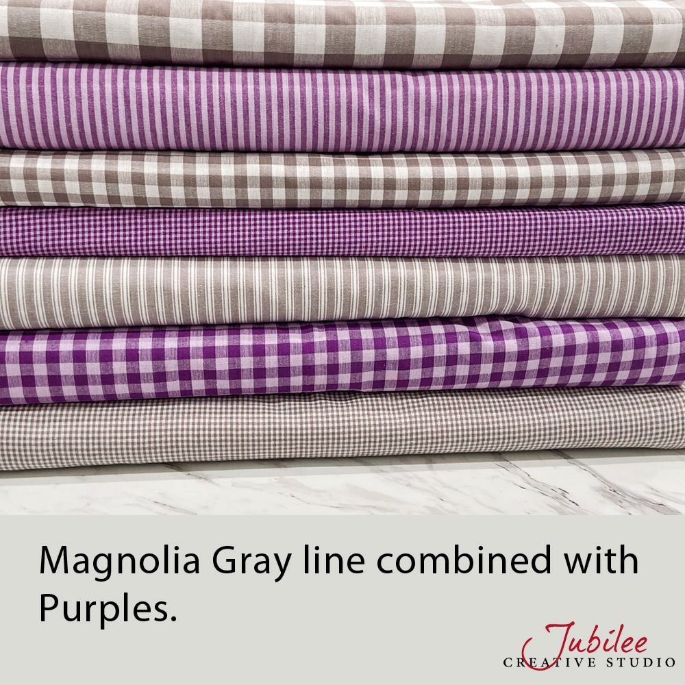
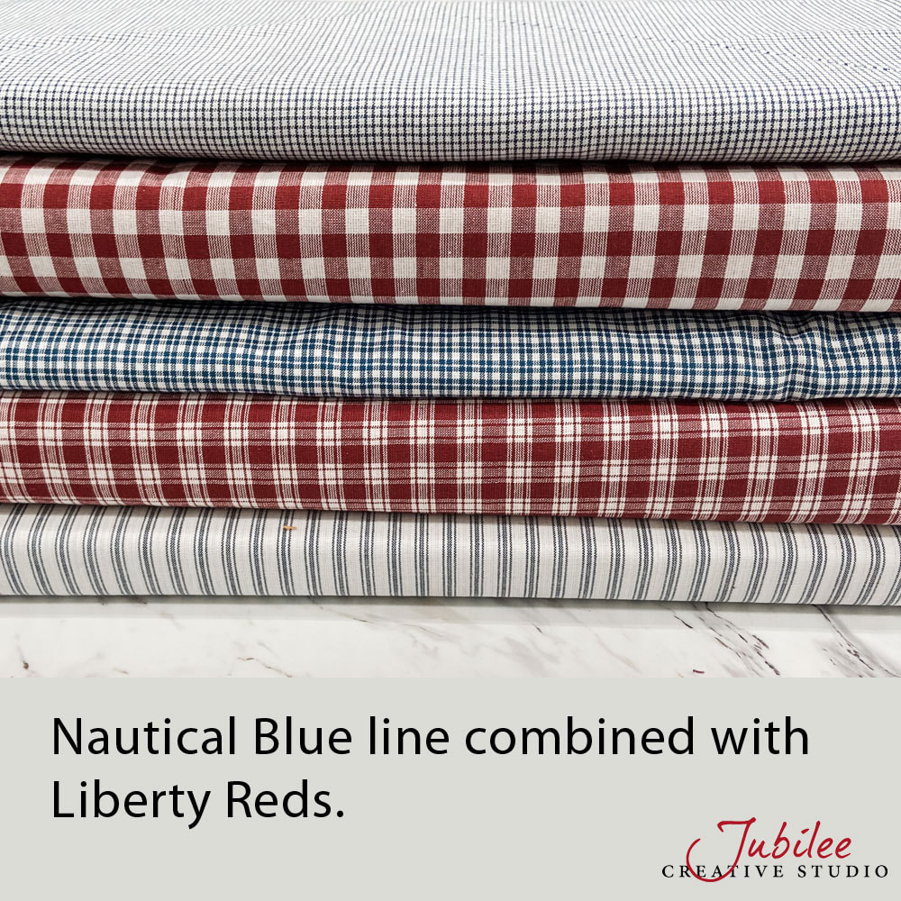
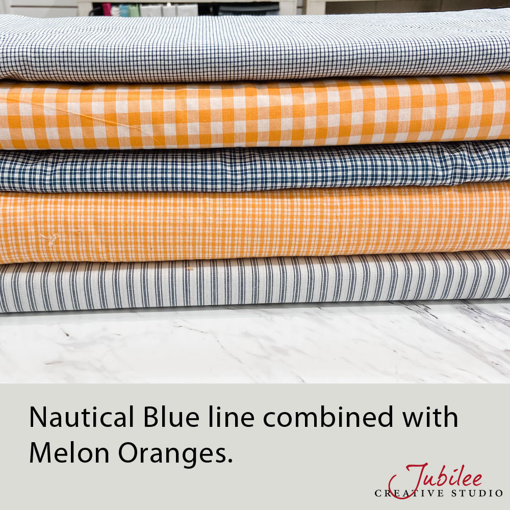
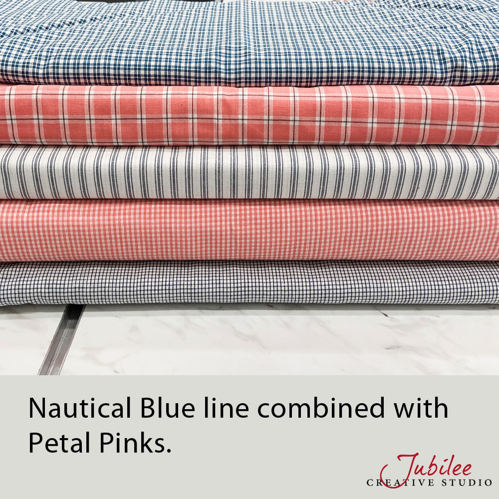
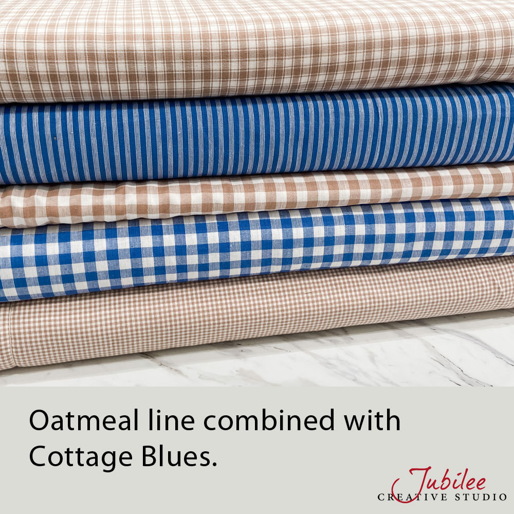
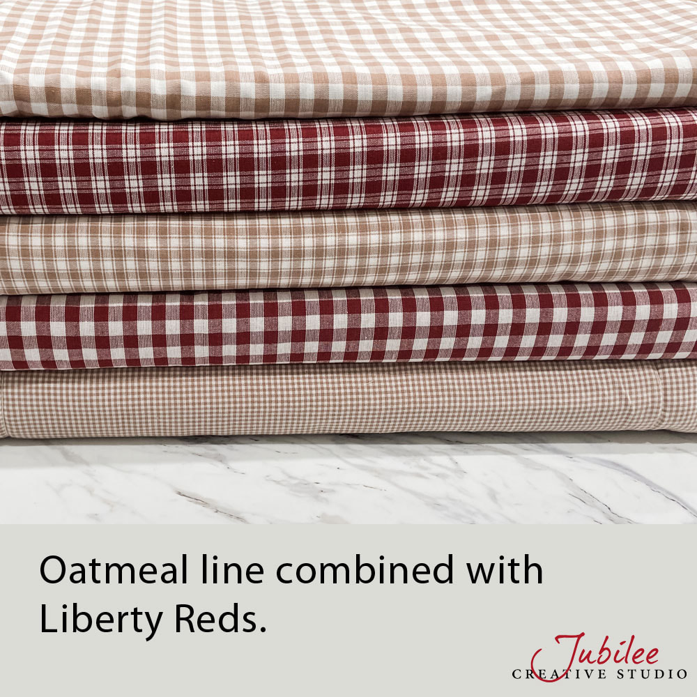
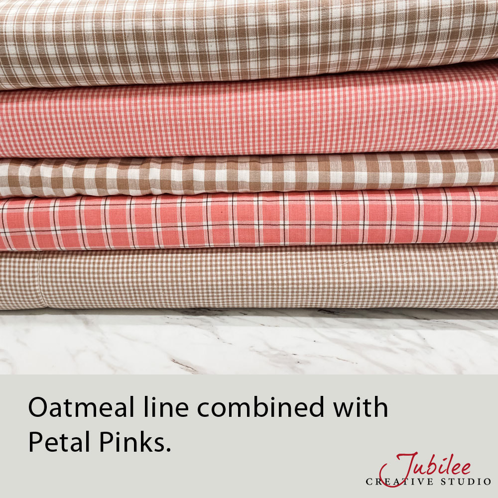
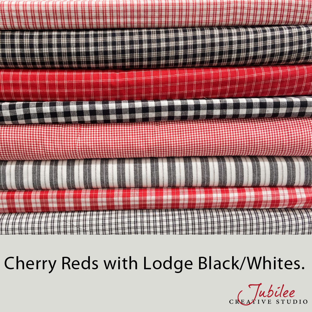
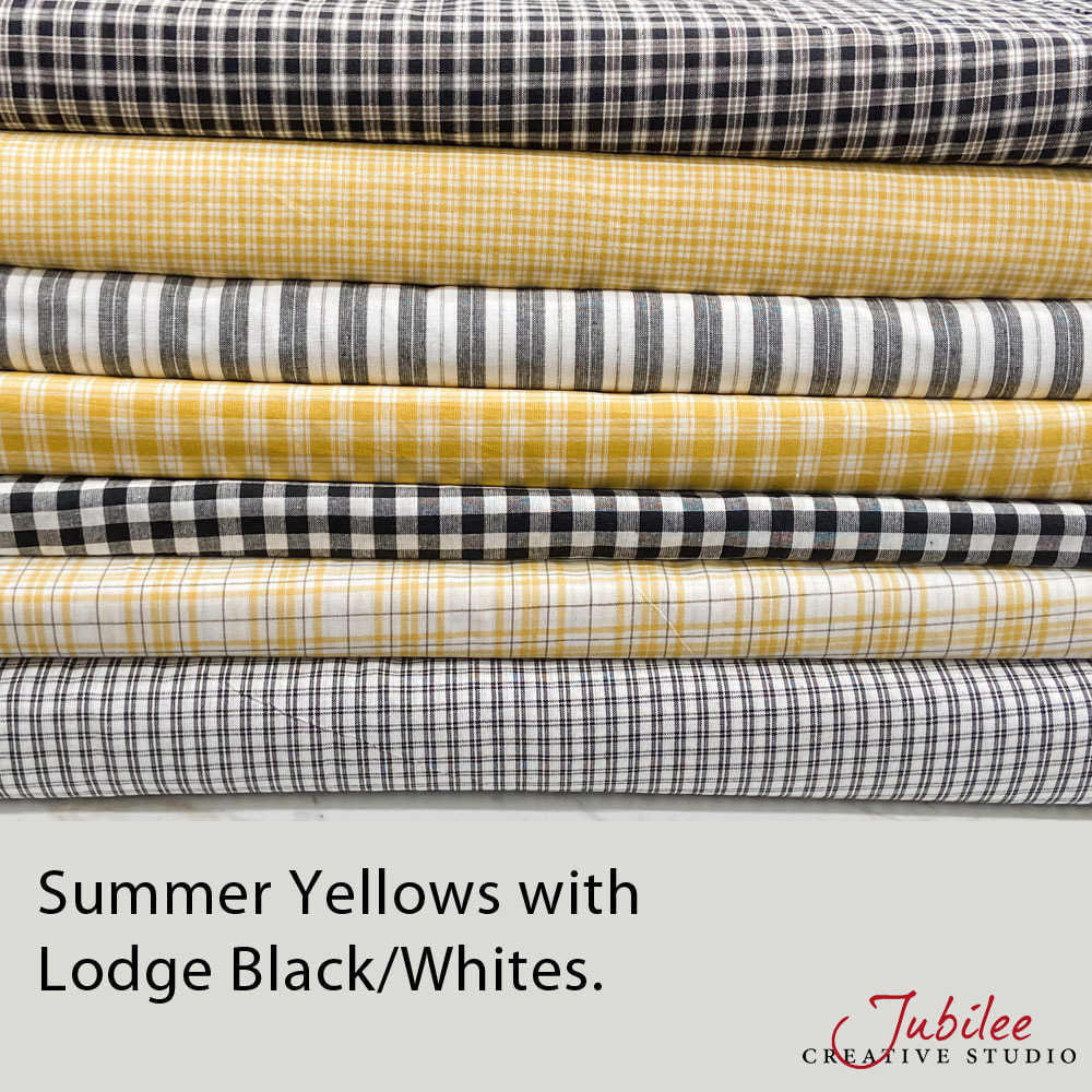
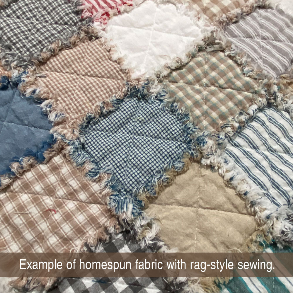
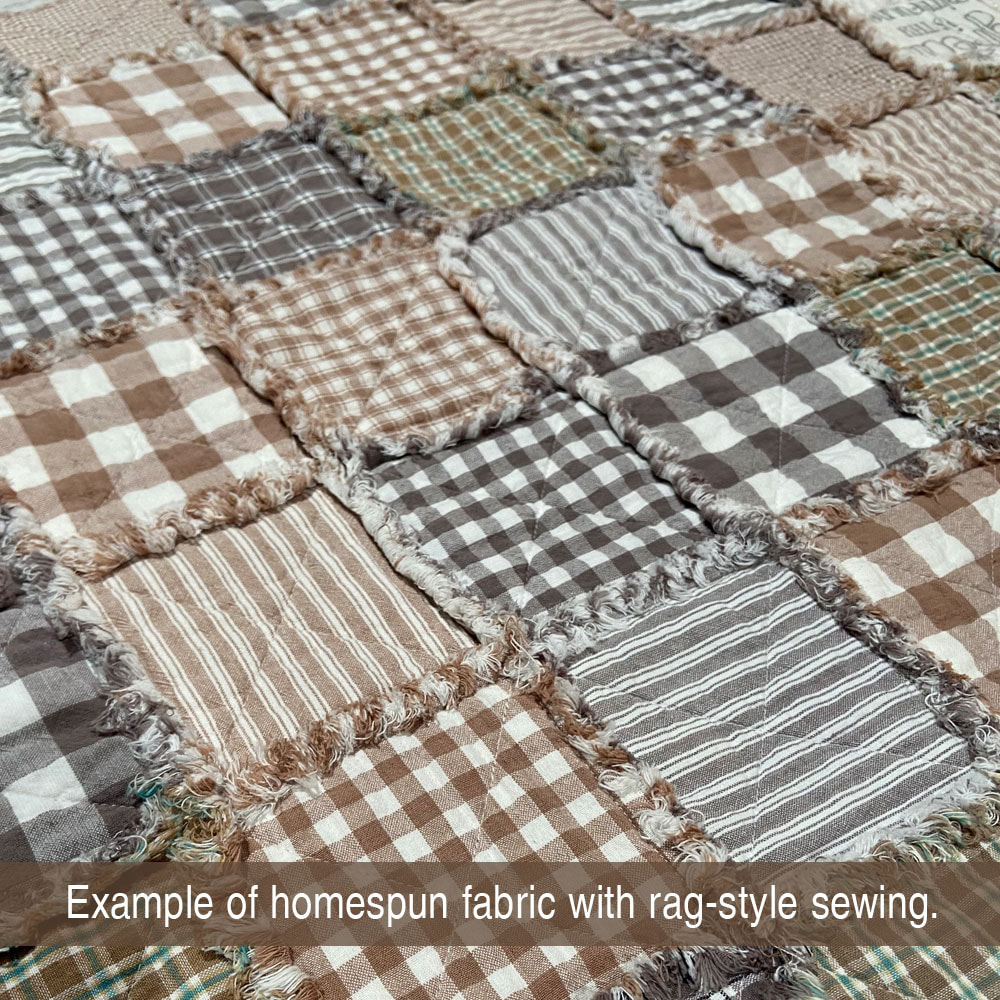
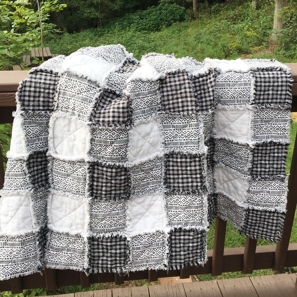
Another great everyday choice is to use one of our neutral lines such as Magnolia Grays, Oatmeal, Lodge Black or Nautical Blue and combine it with a more colorful color of your choice. Just be sure to keep your neutral (white or primitive) matched up and the creative options are many!

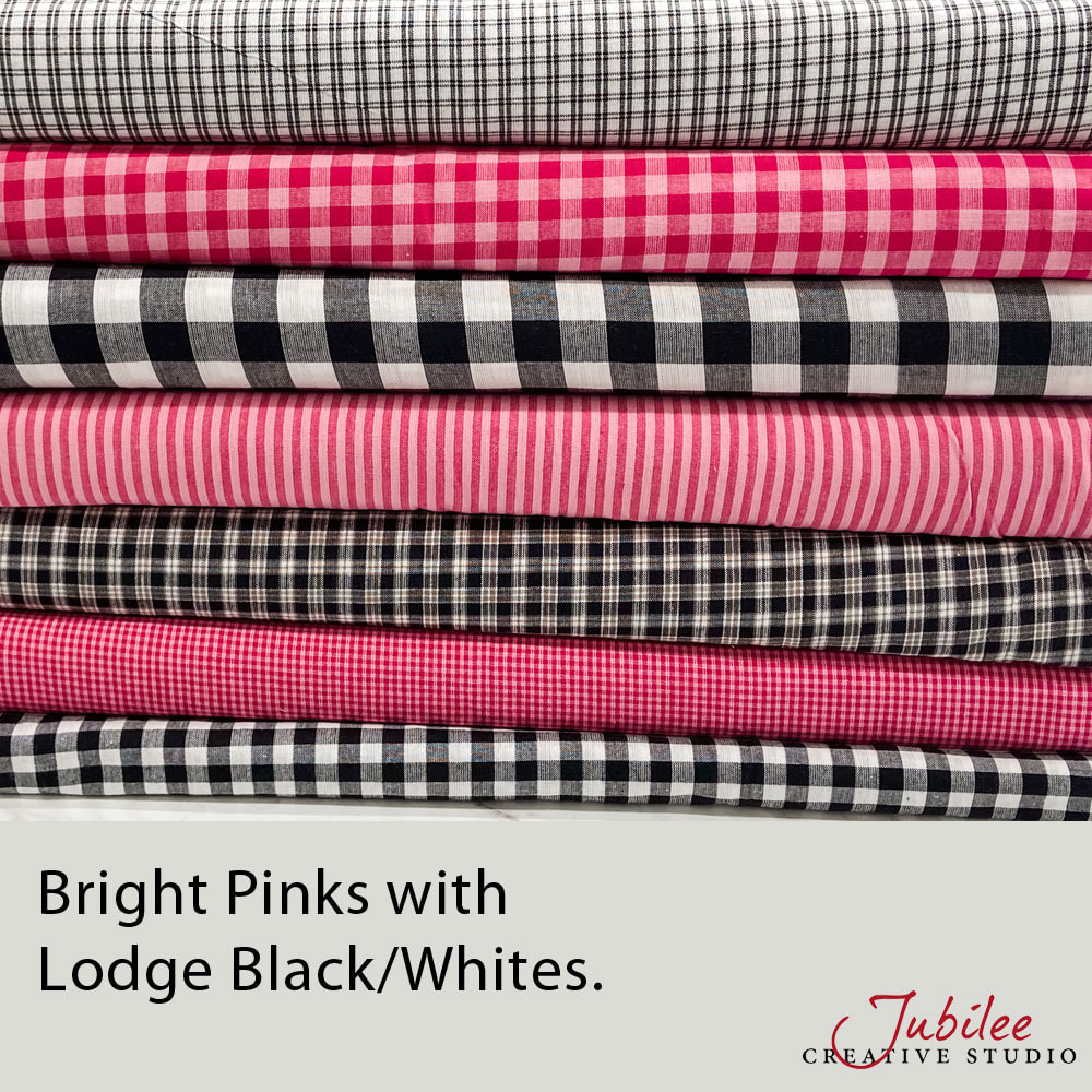

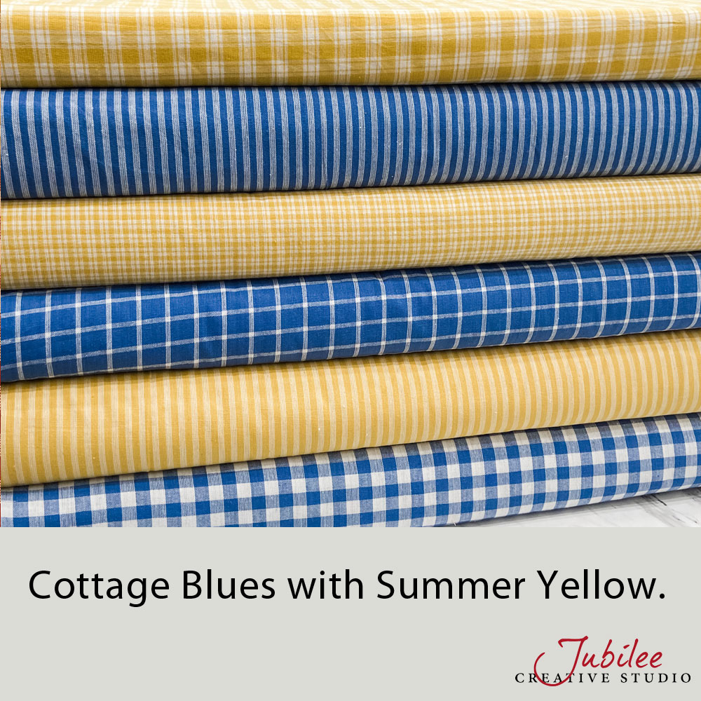
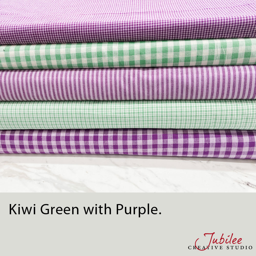
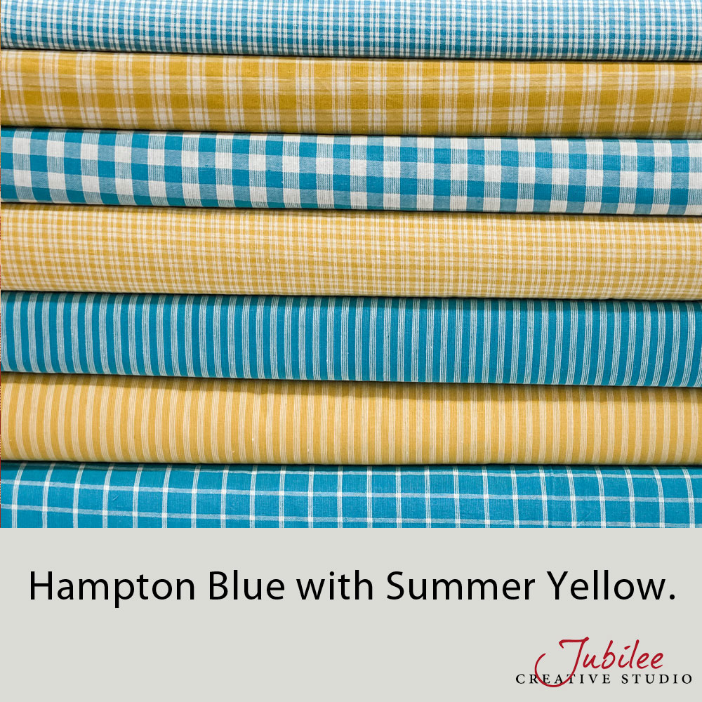
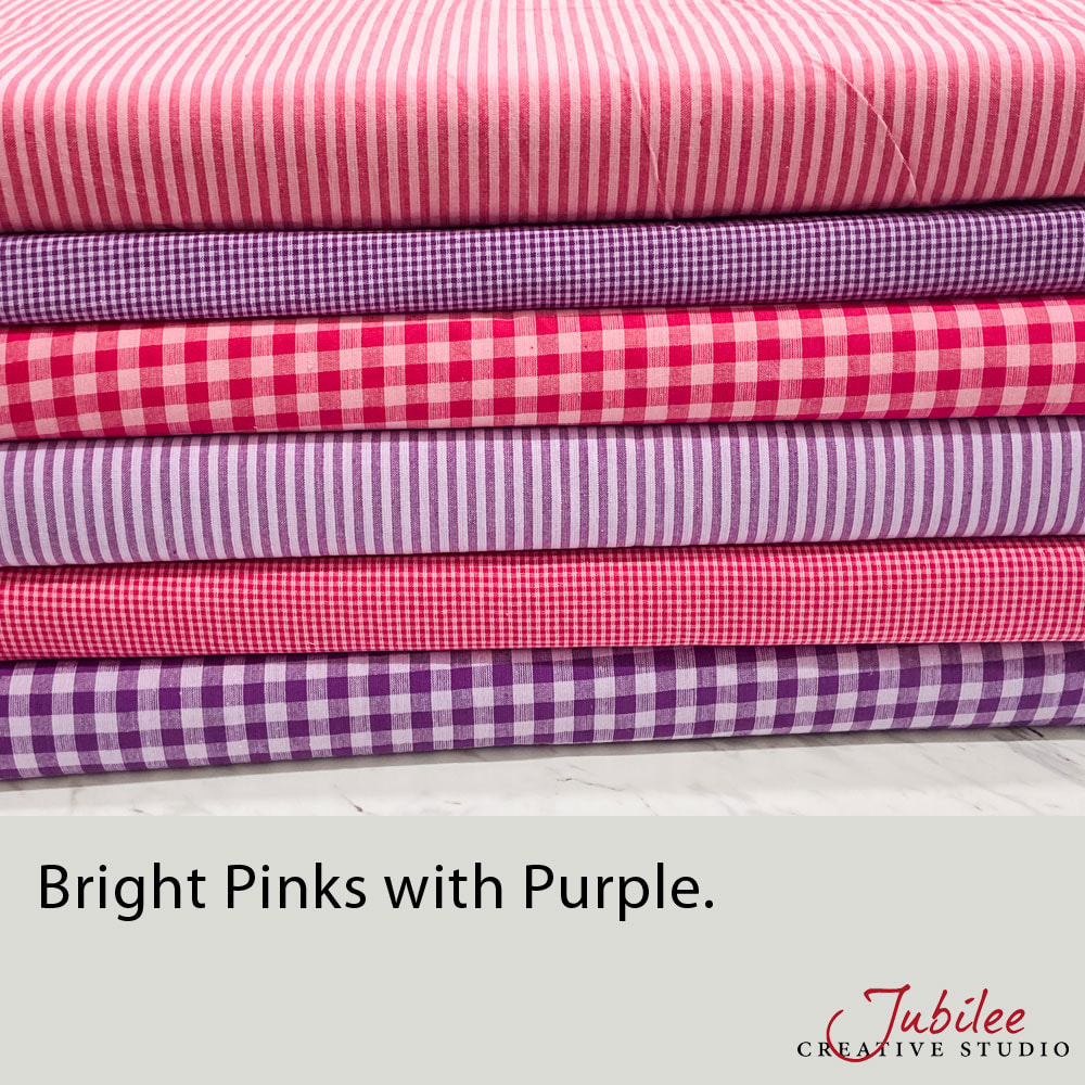
Looking for something bright and cheerful? Anything in our Bright fabric category mixes and matches very well. Use them all for a colorful random mix or select just a few of your favorite colors.
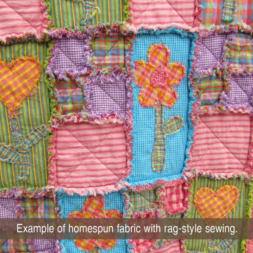
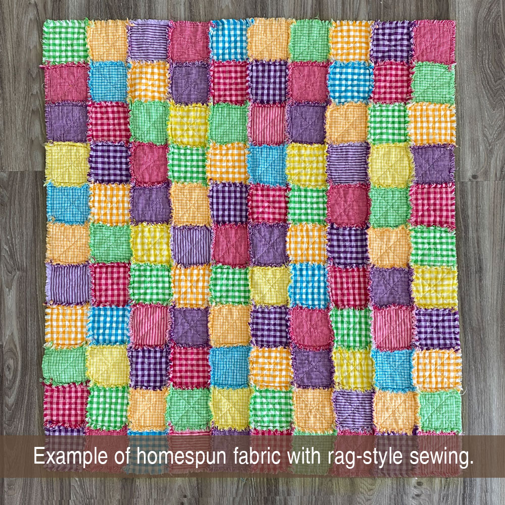
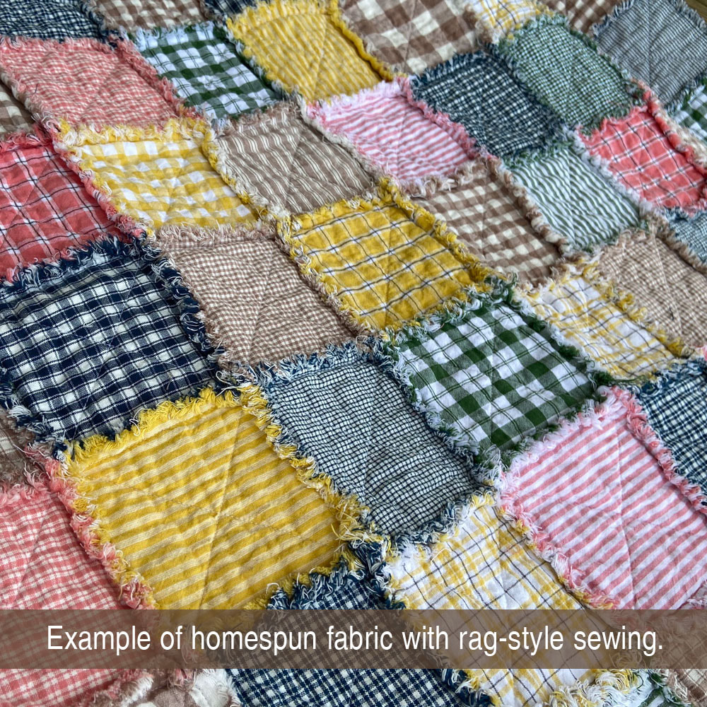
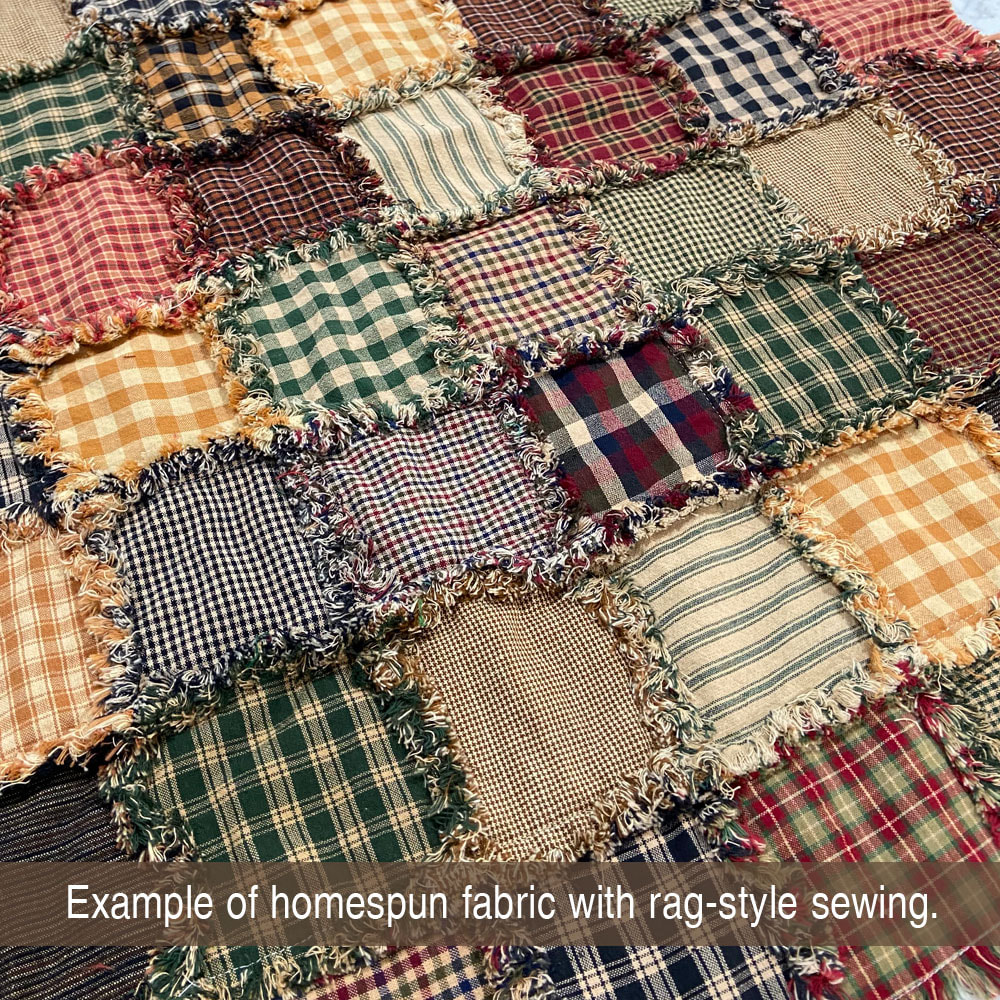
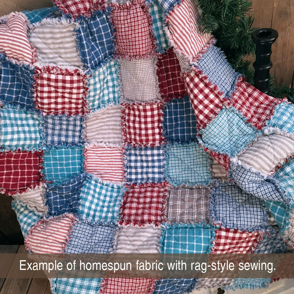
There are no rules or guidelines regarding which basic colors you should include in your project. Most rag style projects will use multiple fabrics together for a "random patchwork" look but there is also a strong case for strategic color/fabric selection and arrangement for a more "designed" look. When making a random patchwork quilt, I like to have as many different fabrics as I can. I separate all those squares into two logical groups based on color such as reds/blues or light/darks. Then I assemble the quilt by alternating between the groups. In that way, you'll never have the same fabric side by side. The quilt gallery below shows many different color groupings in a random assortment assembly.

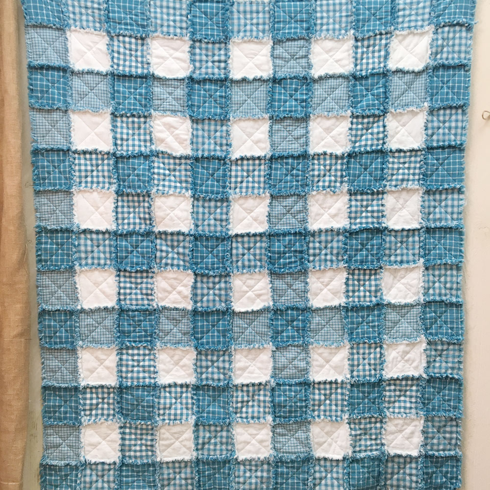
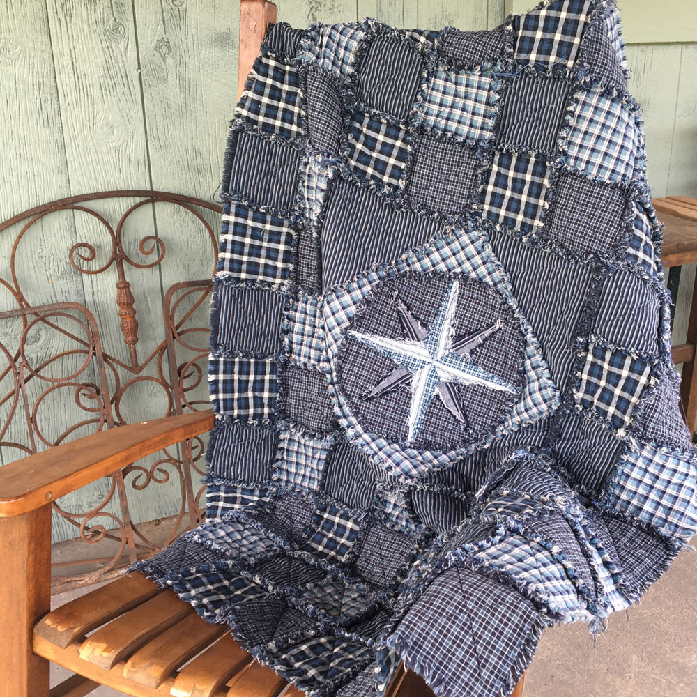
As always, a more structured fabric combo and design can have a beautiful outcome as well. Examples of designed layouts where fabric and color are intentional are in this quilt gallery below.


If you need to see fabrics before purchasing, please know that we have a sample product option available here: Buy Samples If the exact shade of color is important, we always recommend samples before purchasing.
We love to see pictures of our customer's quilts and projects! When we send out really nice color combos, we always wonder what the end project is going to be. So if you create something beautiful, send us a picture so we can share it on Facebook. Click the shopping link below to go back to the fabric website: JubileeFabric.com. Or stick around here and explore some of our great project ideas for rag style stitching!
We love to see pictures of our customer's quilts and projects! When we send out really nice color combos, we always wonder what the end project is going to be. So if you create something beautiful, send us a picture so we can share it on Facebook. Click the shopping link below to go back to the fabric website: JubileeFabric.com. Or stick around here and explore some of our great project ideas for rag style stitching!